Architecture is meant to stir emotion. From the Holocaust Memorial in Berlin to the Staples Center in LA – their designs have a purpose. Many of us may pass a building everyday on our way to work and never notice it, while other buildings may bring out more intense feelings – regardless, they are all interconnected with our lives and with our emotions.
Daniel Libeskind says, “[I]n buildings that move us, there’s an element of care. It’s not a question of whether a building makes us feel good or bad. It’s about being moved. It’s something that goes very deep.”
Take a look at these three unique buildings that used steel in creative ways. Most architects and engineers work to hide the steel underneath the walls and floors, but these three architecture firms brought the steel to the exterior – and to dramatic effect. Even if you have never seen or been in these buildings, we can all imagine what it would be like. Try to focus on the emotions you may feel when you read about the buildings and tell us about it in the comments below.
Zaha Hadid’s Investcorp Building, Oxford University
The Investcorp Building, located in Oxford University’s St. Antony’s College, is part of the school’s Middle East Center. Named after the investment firm that donated £11 million to have it built, the building includes a library, classrooms, and offices. Designed by the late Zaha Hadid, considered to be one of the most famous avant-garde contemporary architects of our time, the project has evoked a multitude of emotions from those on campus.

Zaha Hadid’s Investcorp Building at Oxford University stands out among the Victorian buildings surrounding it. (Photo courtesy of Forgemind ArchiMedia)
Conspicuously different from the other Victorian buildings found on Oxford’s campus, the Investcorp Building has brought out supporters and detractors. Some said that it “Looks like a beached whale,” or “No, a crashed airplane.” While some of Hadid’s supporters, like the center’s director Eugene Rogan said, “Every line meant something. It bends the brain. I’m in love with this building and I can’t hide it… there’s something Daliesque about it.” The Independent even went so far as to say that it was “undoubtedly Hadid’s most intriguing small building.”

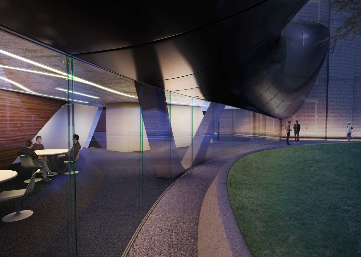
The glass walls underneath the Investcorp Buildings allow students to see the grounds of Oxford University campus. (Photo courtesy of Forgemind ArchiMedia)
Many will argue that the building does not blend in well with its surroundings on Oxford’s campus, but it is also hard to deny the precision and expertise that went into the design. Love it or hate it, Hadid’s Investcorp Building is one that will fuel debate for decades to come.
Turkey’s Raif Dinçkök Yalova Cultural Center
The modern Raif Dinçkök Yalova Cultural Center was designed by Istanbul’s Emre Arolat Architects. It is a mini-city in a box with different multi-purpose facilities inside that are connected by a vast maze of ramps and walkways.
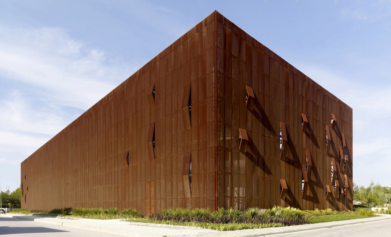
Its unique exterior is made of corten steel, short for “corrosion resistance” and “tensile strength,” a type of weathering steel that has no need for painting. Over time it develops a rust-like appearance while maintaining its resistance to atmospheric corrosion.

Turkey’s Raif Dinçkök Yalova Cultural Center uses weathering steel to striking effect. (Photo courtesy of ArchDaily)
The intentionally rusted facade offers a blank canvas for the city and serves to heighten expectations of what might be inside.
Arch Daily says, “The surface, which is also suitable for recycling, acts as a natural palette, containing the changes it will go through, like the color and tone changes caused by oxidation. This movement will make the relationship between the city and the building more interactive.”
Frank Gehry’s Walt Disney Concert Hall, Los Angeles
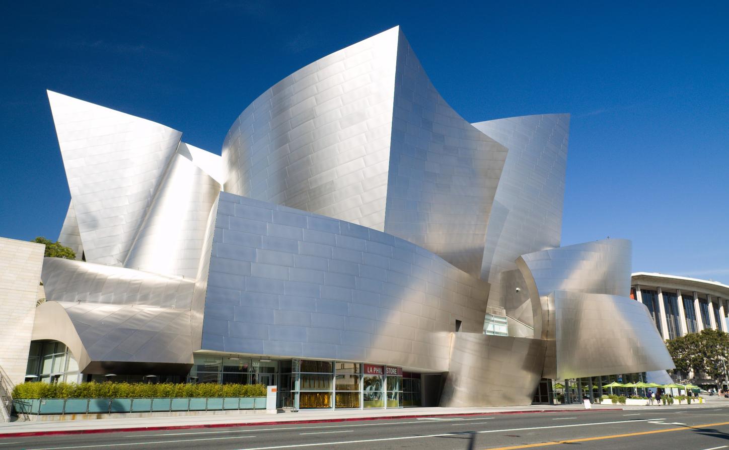
Frank Gehry’s stainless steel Walt Disney Concert Hall remains one of the famous architect’s most well-known works – as well as one of the most famous buildings in LA. Architectural Digest called Gehry the “most important architect of our age,” and the LA Times said that “Disney Hall accomplishes all the things Gehry has become famous for and all the things he was supposed to be incapable of doing.” The stainless steel jutting out into the landscape is both striking but soft.
“Ten years after its debut, it remains the city’s greatest room.” -Christopher Hawthorne, LA Times

Frank Gehry’s Walt Disney Music Hall has become one of LA’s most well-known landmarks. (Photo courtesy of Milo & Silvia in the world)
Some patrons have argued that entry into the hall is rather abrupt as one must move from the sidewalk directly into the lobby, with little fanfare. Then, having entered the hall, even the lobby is considered “narrow and asymmetrical.” But Gehry seemingly did this on purpose “in an effort to save the architectural and emotional payoff for the moment when you walk into the auditorium itself.” He realized that this building was to be a monument to the music and musicians that played there, and so he wanted the focus to be on that aspect – minimizing the rest for emotional effect.
What do you think of these buildings? Tell us about some other buildings that sparked an emotional response in you.
*Cover image: Walt Disney Music Hall, photo by Prayitno.
Don’t miss any of the exciting stories from The Steel Wire – subscribe via email today.
